Have you heard that “abortions are only 3% of what Planned Parenthood does”? That number is sort of true, but there are a lot of problems with it, as has been ably documented elsewhere. It’s been a tedious little irritant in internet comment threads for months. Tonight, we heard it one too many times, in the context of some angry pro-choicer who was internet-screaming obscenities at pro-lifers who were “trying to kill women” by defunding Planned Parenthood. (For the sake of our blood pressure, we let slide the 168,740 girls Planned Parenthood literally killed last year.) We resolved to return to our lair Institute, do some math, and put out a more interesting number.
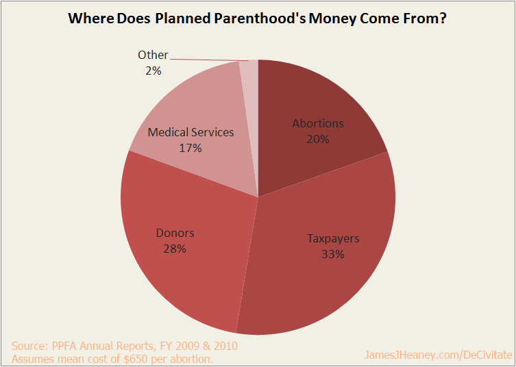
Planned Parenthood reached its 3% number by counting (and, by some standards, double-counting) all services provided. We decided to count dollars instead. Here is what we learned:
Paints a slightly different picture, doesn’t it?
All figures are derived directly from Planned Parenthood’s website, mainly its annual reports.
These findings refer to Fiscal Year 2009. We used FY2009 instead of FY2010 (which is also available) because, in FY2010, Planned Parenthood changed its accounting method. Medicare insurance dollars, which were previously classified under standard clinic revenues along with all other insurance reimbursements, was removed from the clinic income item and instead merged into the government grant column. This is a perfectly sensible accounting decision, but it meant that, if we used FY2010 figures, we would inevitably double-count tens of millions of dollars of Medicare funding that went to abortions. This would have been unfair to Planned Parenthood. Fortunately, according to footnote [c] of the 2010 report, the actual underlying revenues barely changed between 2009 and 2010; the main difference was in the accounting change I’ve just discussed. This means that our chart is still substantially accurate for 2010, even though it is based on 2009 data.
This chart assumes that the mean cost of an abortion at Planned Parenthood is $650. Planned Parenthood does not provide this information, presumably because it would allow someone to make a chart very much like this. We did the best we could, while still sticking to our plan to rely exclusively on information provided by Planned Parenthood. Their website notes that a first trimester surgical abortion — by far the most common abortion method — costs between $300 and $950. The less-common pharmaceutical abortion, which relies on mifepristone and various mitigating drugs, costs between $300 and $800, and must be used before the ninth week. Second-trimester abortions cost thousands of dollars, and third-trimester abortions are very rarely (if ever) performed at Planned Parenthood clinics, and are astronomically expensive when they are. We simply split the difference between $300 and $950. If Planned Parenthood is familiar with the actual mean cost of one of their abortions, we would welcome an email from Sarah Stoesz telling us what it is, and will amend our chart accordingly. (Of course, we would expect them to do this only if the mean cost of an abortion is actually less than $650.)
It is worth noting that other pro-lifers have come up with somewhat more conservative figures when attempting to measure this same mean cost. The first of those linked, however, appears to be simply wrong about the information on PP’s website (or is out-of-date), whereas the latter two rely on “various sources” too vague for us to rely on.
Planned Parenthood provided 331,796 abortions in 2009. Approximately 10% of all clients (counting men) received an abortion. Here is my raw financial data (all figures in millions except when noted):
| Abortions | $215.7 |
| Taxpayers | $363.2 |
| Donors | $308.2 |
| Medical Services | $189.2 |
| Other | $24.5 |
| Total | $1.1 billion |
We at the Institute are but an amateur, so please feel free to make suggestions or corrections in the comments. Alternatively, if you like the chart, post it everywhere. I’d love to see Planned Parenthood’s 3% deception lose a little bit of its power in the public square.
EDIT: Apparently, I am math-challenged tonight. Splitting the difference between $300 and $950 yields a mean of $625, not $650. If this were reflected on the chart, it would take away 1% from the Abortion wedge (leaving it at 19%) and add 1% to the Medical Services wedge (raising it to 18%). I will fix this at some point, when I have time.

