
OVERALL:
After three months of stability, a significant covid surge is underway in Minnesota. We are a long way from our hospitalization capacity, and it may get itself under control in another week or two. Nevertheless, public health officials are undoubtedly trying to figure out how to mitigate it, because the surge could just as easily continue.
DETAIL:
The chart really tells the story here. A surge that looked like lots of other false alarms started in the third week of September… but then it kept going into the fourth week of September and the first couple days of October, with a small (but by no means certain) downswing just as the data runs out:

This data lags by six days. “LTC” is short for “long-term care” (basically, nursing homes). The above estimate is for non-LTC cases. (This estimate assumes test positivity rates between LTCFs and the general population are more or less the same.)
So, for people who don’t live in long term care, case counts are approaching the heights they reached in May, at our first peak.
Fortunately, LTCs still seem to be doing fine. Since the most vulnerable people live in LTCs and the most devastating spring outbreaks happened there, this is very good news.

As I state every week, my daily estimate of “actual new cases” is derived by taking the current 7-day average positivity rate, dividing it by 2% to yield a multiplication factor (minimum 1.0), and multiplying the officially reported non-LTC cases by that factor. This is crude enough that, when positivity is significantly above 2%, the precise numbers may be way off… but it should be accurate enough for us to trust the trendline.
Here is the raw, official state data I use to build these estimates:

Despite that giant jump in case counts, test positivity has held pretty close to 5%:

This is because our testing has increased as cases have increased. In the past 14 days, Minnesota has conducted about 23,000 tests per day, on average. For those of you who remember back in April/early May, when they couldn’t break the 10k barrier, it’s pretty cool that we have this many tests now.
Lower positivity rates = fewer undetected cases = more accurate and higher official counts = lower actual cases. The fact that we’ve been able to hold the line on testing even in the middle of a surge is really quite helpful. On the other hand, it has to be worrying to the Minnesota Department of Health that a testing surge this big was only barely large enough to hold the line.
As I noted at the top, all this data lags by 6 days.
The start of the surge three weeks ago coincided with a surge in hospitalizations. This is somewhat surprising, because you would normally expect to see a surge in hospitalizations a week or two after the surge in cases. Instead, the surge starts in both datasets around September 17th:

The header on that hospitalization chart mentions “new data.” That is because, this week, Minnesota switched to a new data reporting system for COVID hospitalizations. It’s pretty slick.
The main new feature (for me) is new information about non-covid cases in hospitals, which allows us to calculate a daily surge capacity (instead of using the crude surge capacity estimates I was using before).
On the other hand, all the numbers are slightly different, probably due to differences in reporting methods. A number of ICU hospitalizations have apparently been reclassified as non-ICU hospitalizations.
However you slice it, though, it’s clear hospitalizations are up quite sharply:

We really do appear to suddenly be back in the vicinity of Minnesota’s first peak, back in early May… except that we aren’t seeing a whole lot of people drop dead.

The reason we aren’t seeing as many deaths seems to be that we’ve done a better job protecting the elderly, particularly those in nursing homes. We should also give some credit to improved covid treatments (thanks, doctors, nurses, and Big Pharma!).
Nevertheless, deaths are ticking up a bit. Hopefully that will soon reverse. However, a big surge in hospitalizations doesn’t bode well.
WHY A SURGE?
Oh, heck if I know. I can fiddle with charts, but covid has defied smarter men than me plenty of times.
Statewide voluntary social distancing levels have returned to pre-covid levels outside the Metro. That could certainly help it spread, and might explain why the Health Department is talking so much about rural hotspots. But could this alone cause that drastic increase? Why the late-September inflection point? And the Health Department is reporting cases rising statewide.
I hear lots of states around us are having bad times of it. We have a lot of commerce and other intercourse with our neighboring states, so, if they get sick, we’re likely to catch it from them. But I lack the werewithal to parse through all the journalism and find out just how bad it is in Wisconsin, Iowa, and the Dakotas; tracking Minnesota is hard enough.
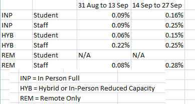
The timing of the surge makes me look at school openings with a lot of suspicion. That bums me out, since I’ve been high on school openings. And I mostly still am: there seems to be not much evidence of schools causing surges like this one, school-linked Minnesota covid outbreaks are few and far between, and the National COVID-19 School Response Dashboard (run by School Principals associations) shows no significant differences in infection rates between distance-learning and in-person schools (nationally).
Still: cases started surging a few weeks after the school year started. We’d be silly not to examine whether school is a contributing factor.
Whatever the cause of the surge, it’s happening, and there doesn’t seem to be much we can do about it at the moment other than keep ourselves safe and don’t take dumb risks! Pretty much the usual!
SELECTED GROWTH RATES
Average week-over-week growth in estimated cases, July 30th-Aug 6th: 3%
Sep 4th-10th: -9%
Sep 11th-17th: -15%
Sep 18th-24th: 50%
Sep 25th-Oct 1st: 28%
All data is either directly from here or derived from data from here: Minnesota Department of Health: Situation Update for Covid-19 . I went into a little more detail on some of these data in my post Covid Takes A Breather a few months ago. And I finally uploaded my giant Excel worksheet to Google Sheets so you can see the raw numbers and calculations I am doing. Fair warning, though: I did absolutely nothing to clean it up. It’s a mess. Please enjoy Reinhart-n-Rogoffing me.