
A post-script to my recent article on the national debt.
NOTE: This post was originally published at my Substack. The footnote links go there instead of to the bottom of the page.
If you’ve recently read my explainer on the national debt, I say very clearly and repeatedly that printing money causes inflation.
Yet you may be thinking to yourself, “Hang on, James! The Fed has been throwing bags of money into the economy at record rates for over ten years!” This is true. The Fed has created new money at an astounding rate since the financial crisis. They’ve been shoveling money our way so fast that keeping baseline interest rates near zero for a decade wasn’t enough. They had to introduce new ways of printing money and handing it to Wall Street, like so-called “quantitative easing.”
And yet inflation in the 2010s was much lower than it was in the 1990s and 2000s! That’s why we all forgot about inflation, and why it was such a surprise when it hit in 2020! So maybe printing money actually doesn’t cause inflation??
It’s a fair question.
After the 2008 financial crisis, there were widespread fears that government “stimulus bills” to aid the recovery, combined with Federal Reserve monetary stimulus, would expand the amount of money in our economy too much, causing runaway inflation and even more economic havoc than the Recession. I shared those fears, and opposed the stimulus bills. But I was wrong. There was no havoc. The recovery proceeded slowly but steadily, quantitative easing went off without a hitch, and inflation never reared its head. It was one of the three biggest political mistakes I ever made.1 What gives?
There are many people out there who argue that the amount of money-printing we are doing today really doesn’t cause inflation. They tend to think that only much larger amounts of money-creation would directly cause substantial inflation. Therefore, the current round of rapid price increases must be caused by something else: perhaps large-scale supply-chain disruptions, changing demographics,2 and/or corporate consolidation.3
I think these explanations of inflation all shed some useful light on the problem, but I still think the major cause of inflation today is money-printing. Yet, if you’re going to believe me, I’d better offer an explanation of what happened in the 2010s! So here are two:
Ramesh Ponnuru argues that the Great Recession stimulus didn’t cause inflation because the financial crisis actually contracted the amount of money in the economy, and so even the vast amounts of money the Fed threw into the economy at the time was only barely keeping pace with the vast amounts of money draining out. He thinks we should have spent a lot more money. Even if we had spent more money, he thinks, we would only have been barely keeping pace with the contraction. This tracks pretty well with what we see in the money supply:

During the Recession, the Fed printed a lot of money, and Congress poured a lot of it into the economy, and… it barely held things steady. Compared to the jump in money after the pandemic stimulus, the economic stimulus to get us out of the Great Recession isn’t even noticeable. All this fits nicely with Ramesh’s explanation.
I’m not sure that tells the whole story, though.
It’s important to remember that the Fed didn’t spend 2008-2019 giving free bags of money to everyone; the Fed gave free bags of money to banks and financial firms. You, peon, aren’t allowed to roll up to the Fed’s Discount Window and ask for one bag of free money and a side of fries. The free money is for Goldman-Sachs, not you. And what’s one thing banks, financial firms, and their rich owners all love spending money on, more than anyone else in the country?
That’s right:

When banks, financial firms, and rich people get free money, they invest it. If lots of them get free money, that should drive up the price of investments.
If the stock market reflects the real state of the underlying economy, then stock prices should increase more or less at the same pace as GDP. Growth in the real economy feeds growth in the stock market.
But if lots of free money is flooding the stock market, the price of stocks will begin growing faster than the real economy. Finance columnists call this “asset price inflation,” but that’s just a fancy phrase that means “inflation in the stock market plus maybe home prices.”
Have we seen any asset price inflation happening recently?4
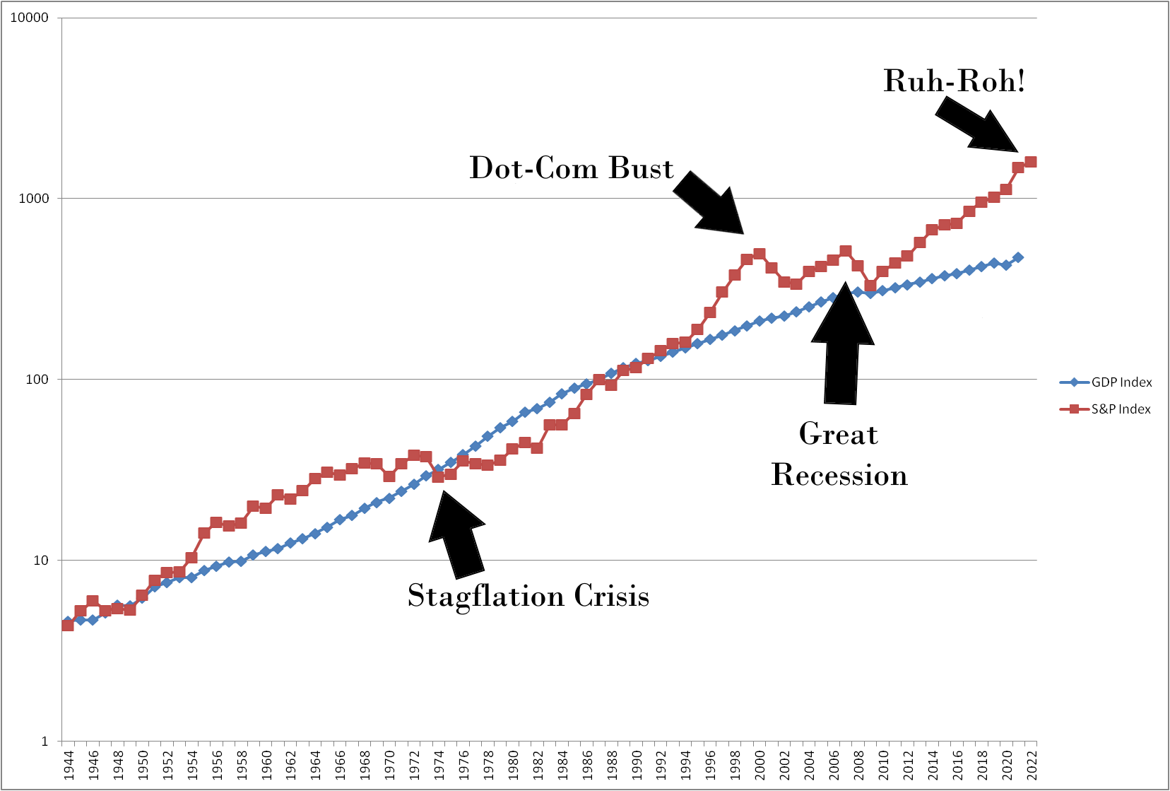
In a healthy stock market, the red line (the stock market) stays close to the blue line (the real economy). If the red line goes above the blue line, that’s a sign of stock market inflation, aka an economic bubble, aka an approaching recession… and, as you can see, the red line today hasn’t been this far above the blue line since before World War II. The same thing’s going on in home prices:
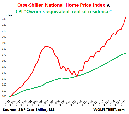
So here’s another possible way of explaining the low-inflation decade we just lived through: inflation was actually very high all along. We just didn’t notice, because the U.S. Government was giving free money only to banks and financial firms, which invested it. Inflation was happening in the stock market, and Millennials complained they couldn’t afford to buy a house, but this inflation didn’t hit the average voter at the gas pump or the grocery store. (In fact, older voters enjoyed their rising property values!)
Then, in 2020, the U.S. Government finally started giving the rest of us free money, aka those nice big covid relief checks… and boom, suddenly everything’s inflating, not just stocks and housing.
You could pick Ramesh Ponnuru’s explanation or mine. Or you could pick some combination of alternative explanations that do not involve monetary inflation. Or, the most likely explanation: some combination of the above. (Good luck choosing right. Economics is not really a science yet. It’s still closer to gut instincts and pig entrails.)
Since I find Ponnuru’s explanation and mine persuasive, the bottom line for me is: it looks like printing money does cause inflation after all. The past ten years of low-inflation money printing were therefore a peculiar exception, not the rule. Today, we pay the piper.
The others were my belief that the Iraq War would be clearly good for most Iraqis within a very short timeframe, and my belief that Donald Trump was too broadly dishonest (and too fundamentally unlikable) to win the primary, or win the presidency, or deliver on his most important promises once in office.
This one’s impressive, because look at its predictions for inflation in 2021, and then look at the date on it.
As I mentioned in the last article, there are disagreements between different camps about whether price increases from one or more of these factors even counts as inflation. Such price increases might be just… real price increases, whereas inflation is often defined as nominal price increases without a change in the real (inflation-adjusted) price. But price increases, however defined, show up in the Consumer Price Index, our main measure of inflation, and get seen as inflation, so we do have to consider how these factors are contributing to CPI.
Graph footnotes: index year is 1987. Chart is obviously logarithmic due to exponential economic growth over time. S&P index data comes from data.nasdaq.com; GDP data from MeasuringWorth.com. Both indicies go back further, but, since U.S. GDP was not officially calculated before the 1944 Bretton Woods conference, I only took these charts back to 1944. I don’t trust pre-1944 GDP figures and certainly not pre-1934 figures.
Now, there’s some reason to dispute whether cutting off the chart in 1944 was a good idea. When you use historically reconstructed GDP measures, you can take this back as far as the 1870s, when the earliest precursors of the modern S&P 500 started indexing the stock market. And what you find on those charts is that stock prices were way higher than the size of the economy would suggest, and that they gradually deflated over the course of 60 years to arrive where they were at the end of the Great Depression. This makes for a much less dramatic final graph, as it starts to look like the 2010s are more of a return to the Gilded Age than an epic financial bubble. In the end, I decided that this is more likely an artifact of imprecise pre-war GDP measurements rather than the actual factual truth… and, even if I’m wrong about that, it’s worth remembering that the Gilded Age was marked by a brutal business cycle of drastic bubbles and rapid collapses, which was a major reason for the creation of the Federal Reserve.