
OVERALL:
Minnesota is in the midst of a very dangerous outbreak of covid-19, the likes of which we have not seen before. The situation is much worse today than it was at any time during the lockdown.
DETAIL:
I put the data in, ran this chart, and swore:
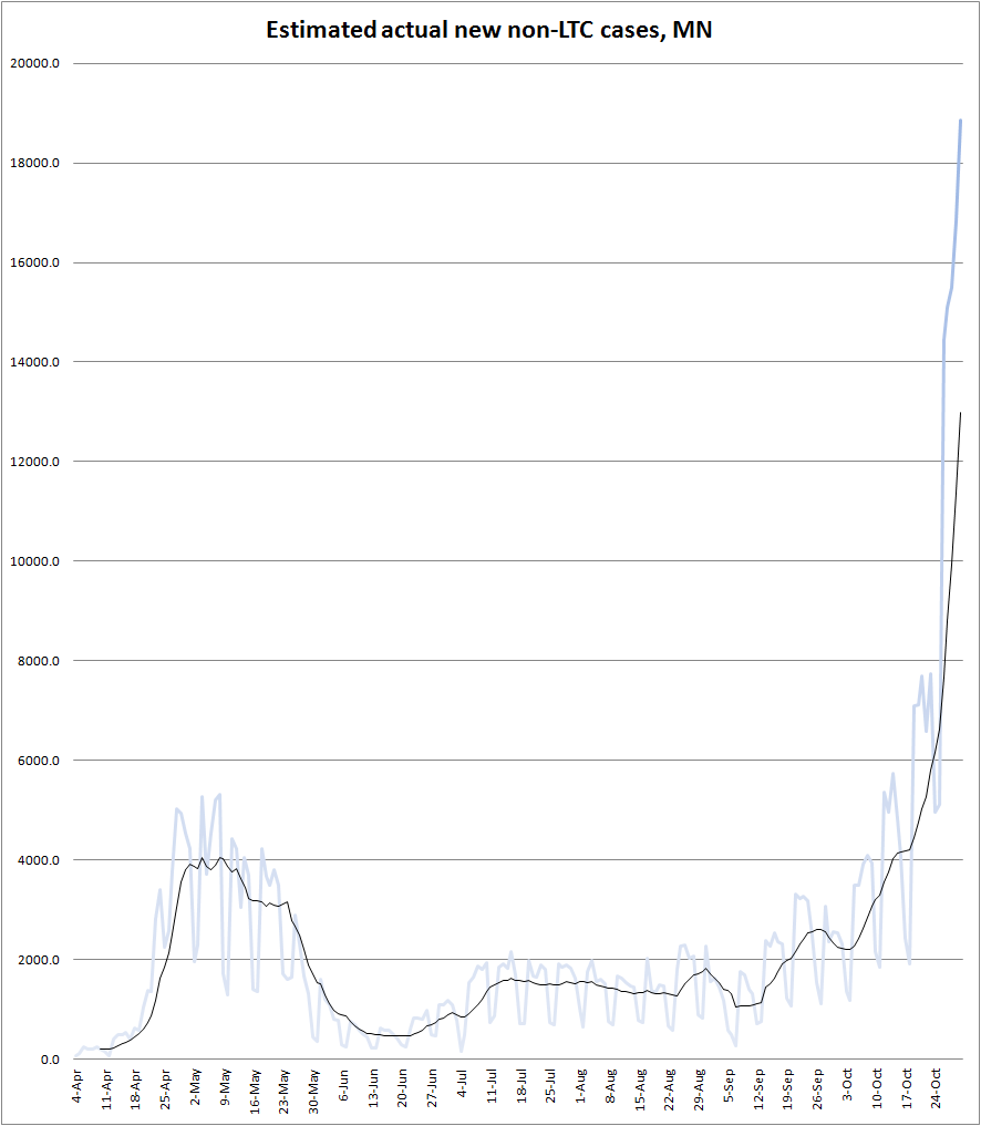
This data lags by seven days. “LTC” is short for “long-term care” (basically, nursing homes).
There are a lot of cases circulating right now. My rough estimate is that there are about 75,000 Minnesotans right now who are either pre-symptomatic or early symptomatic — probably walking around and potentially infecting you.
To put that in perspective: our previous high was 24,000 (estimated) walking infectious on May 9th. From June 2nd to September 19th, the number never went above 10,000. I wouldn’t swear by the exact numbers here, but the sheer scale of how big this outbreak has gotten in the past couple of weeks is clear.
To put that in further perspective: if you see 100 Minnesotans today, this estimate says that 1 or 2 of them has covid and is infectious… and doesn’t know it yet.
For obvious reasons, that’s very dangerous, especially if you’re an older person or are otherwise at risk.
If there’s good news this week, it’s that cases are not rising nearly as quickly in nursing homes as in the general population:
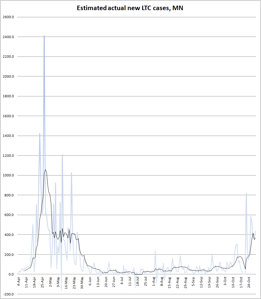
Cases are still rising in long-term care homes — and that spike has killed a bunch of old people — but we’ve managed so far to keep it from getting out of control in nursing homes (unlike in April).
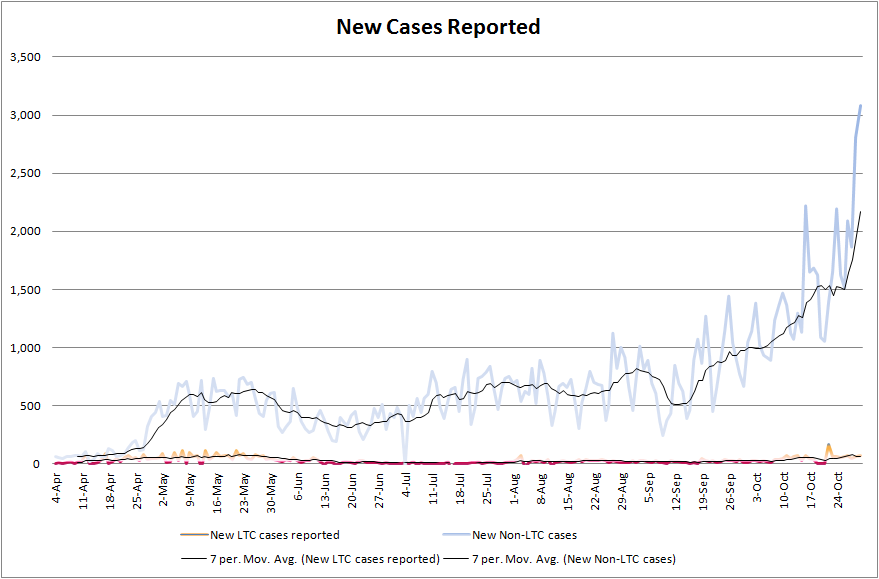
As I state every week, my daily estimate of “actual new cases” is derived by taking the current 7-day average positivity rate, dividing it by 2% to yield a multiplication factor (minimum 1.0), and multiplying the officially reported non-LTC cases by that factor. (This estimate assumes test positivity rates between LTCFs and the general population are more or less the same.) This is crude enough that, when positivity is significantly above 2% (and it is right now!), the precise numbers may be way off… but it should be accurate enough for us to trust the trendline.
Here is the raw, official state data I use to build these estimates:
Our testing capacity continues to grow, but, in the past two weeks, the huge growth in cases has outpaced the growth in testing:
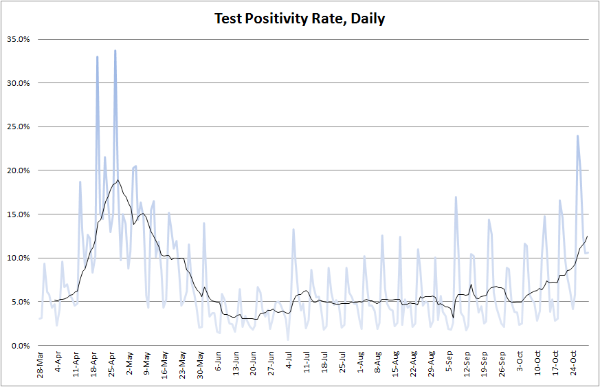
We are way outside the 2% “safe zone.” We are now also outside the 5% “good enough zone.” We’re past the 10% “we’re kind of flying blind” zone. And that’s not for lack of testing! We’re running over 30,000 PCR tests per day right now!
(We’re also running a few thousand antigen tests per day, but I’ve excluded those because of their high positivity rates and need for a confirmatory PCR test. So this is how bad the numbers still are after I nudge them down a little bit with my choice of data.)
That means we are missing more cases. My case estimates at the top attempt to account for that, but, as positivity rises, we become increasingly blind to the spread of the infection, and my estimate (like everyone else’s) becomes less certain.
As I noted at the top, all this data lags by 7 days.
At first glance, hospitalizations don’t look… that bad:
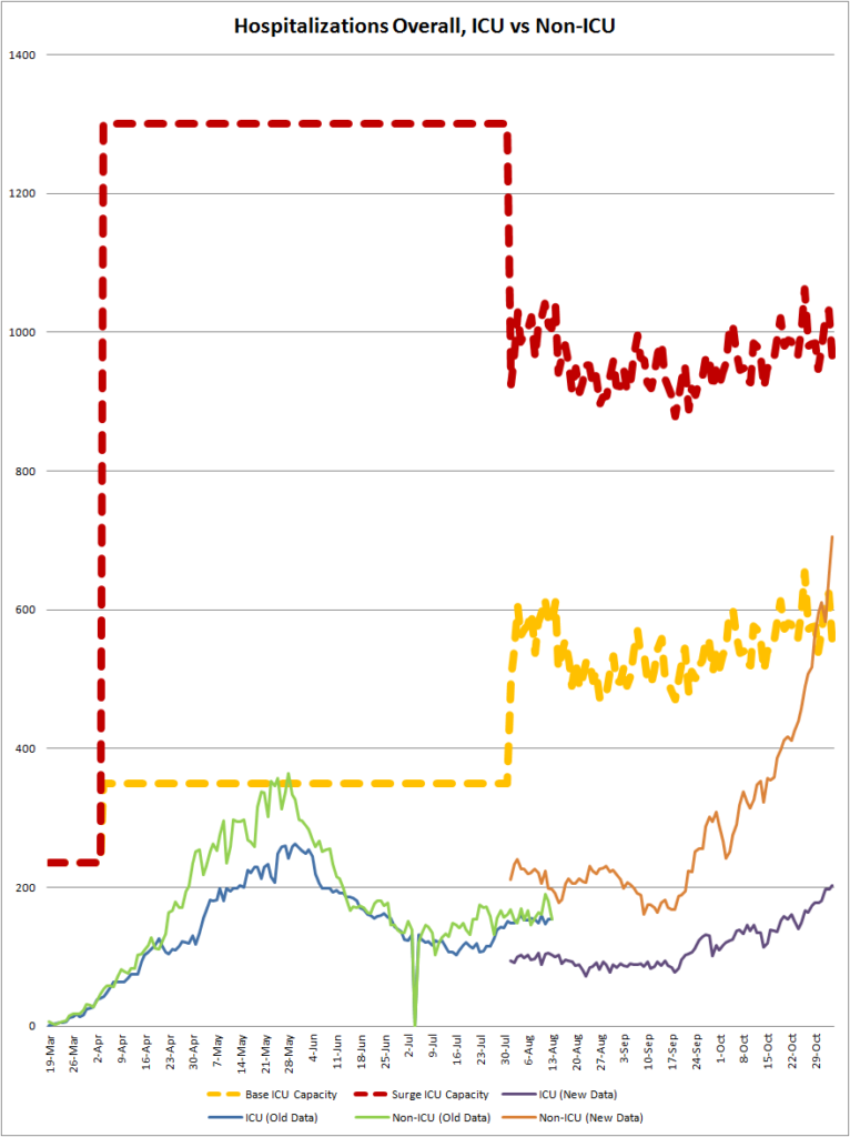
So, according to state data, we aren’t doing too badly on hospital capacity. (We also have around 3,000 free non-ICU beds, too many to even put on this chart.)
But I’ve learned that state data isn’t telling the full story. Both media reports and firsthand accounts indicate that, while ICU beds are sitting out there unused, qualified ICU staff are in the middle of a severe shortage. This is partly because, hey, the economy needs more nurses, but also partly because a whole lot of nursing and medical staff are currently home, either infected with covid or quarantined due to exposure.
Basically, we’re quickly running out of ICU capacity, and it’s unclear how close we are to our actual “wall.”
UPDATE: This isn’t data, but was sent to me by a friend tonight, who is himself friends with some medical workers, and he says he is hearing the same thing from “multiple sources.” (Also, I know you guys skip to the pictures before reading the words, so here’s a picture.)

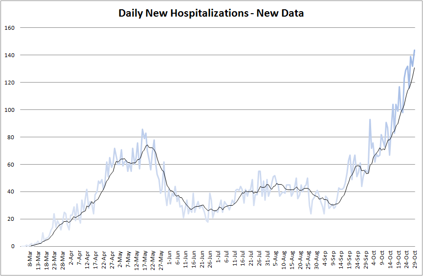
And the tsunami is not letting up:
Both hospitalization charts mentions “new data.” That is because of last month’s switch in how Minnesota reports hospitalization data. As you can see, there’s a significant gap between how many beds were counted as occupied under the old method compared to the new method. But, however you slice it, it appears that our hospitals are under significant strain right now.
If there’s any comfort here, it’s that deaths are still relatively low, but… if several months of reading Marginally Compelling‘s state-by-state monthly covid updates have taught me anything, it’s that a big wave of cases like this is followed by a wave of deaths later:
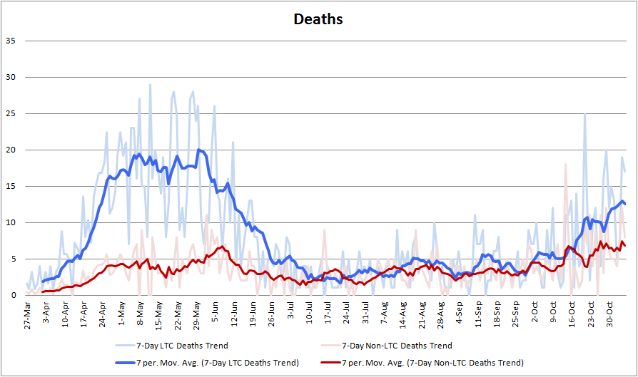
I have some hope based on recent studies which show covid mortality rates falling (presumably due to better treatments, although there are other possible causes). I don’t think it’s going to get as bad as the Minnesota Model projected, but it’s not going to be fun, either.
HOW BAD WILL THIS GET?
What I’ve learned from other states is that waves like this tend to last 6-10 weeks or so, then subside. By my count, we may be in Week 7 of the current wave. (We may also be a little earlier than that.) So this could begin to reverse course soon.
But, frankly, I think these things tend to end largely because people get scared and change their behavior, and I see a lot of people too exhausted by the pandemic (and distracted by the ongoing presidential election) to get properly scared of this thing again.
WHAT TO DO
I don’t expect another lockdown, because the first lockdown was not effective. Plus, a lot of it was pointless. People don’t seem to be catching covid from socially distanced shopping at Ace Hardware with only fleeting contacts with carriers. They almost certainly aren’t getting covid from playing on the playground outdoors.
However, I fully expect Minnesota to close bars, restaurants, and theaters (again), for everything but takeout, within the next week or two. The only thing that gives me pause is… I don’t know how those businesses will survive without immediate financial relief. If Gov. Walz can’t find a way to get these businesses money, he may leave them open despite the death toll.
You, however, should choose to avoid dining out anywhere.
Schools that are open have bent over backwards to stay open, and may still be able to shutter themselves on an outbreak-by-outbreak basis, but… I’m nervous. My daughter’s school (in-person, 5 days/week) had zero cases from August until November 1st. Then it had one case in the preschool, followed the next day by one in 4th grade, and another in 5th grade a day later. There’s no sign yet of transmission within the school building (these were all picked up outside school, it seems), but social distancing protocols can only get you so far when there’s this much covid in general circulation. I just don’t know.
As for you: you should try to avoid getting this. If you’re young, you probably won’t die, but you might need a hospital bed, and we’re running short on those. Please don’t take one up unnecessarily.
And if you’re old or sick or both, you might very well die. Sure, you might have only a 20% chance of dying in your age bracket… but we just sat through an election that went great for Republicans, where President Trump almost came from behind to win (but he fell short; expect an official race call for Biden soon). What was the likelihood of that? As it happens… about 20%. Don’t risk it!
Pod up with a small number of other people — 1 or 2 other households, perhaps — monitor symptoms and exposures, and minimize contacts with people outside your pod. That’s all we can do, really.
FOR MORE FREQUENT UPDATES
Frankly, I’m sometimes not sure why I even bother continuing to do these. Early in the pandemic, lots of people were still getting a handle on the data, but now we have David Montgomery slamming out solid stats every day. He’s my go-to for daily updates, as are his MPR covid reports. If you’re looking for data updated more often than my roughly fortnightly updates, that’s where I would go.
All data is either directly from here or derived from data from here: Minnesota Department of Health: Situation Update for Covid-19 . I went into a little more detail on some of these data in my post Covid Takes A Breather a few months ago. And I finally uploaded my giant Excel worksheet to Google Sheets so you can see the raw numbers and calculations I am doing. Fair warning, though: I did absolutely nothing to clean it up. It’s a mess. Please enjoy Reinhart-n-Rogoffing me.